- Go to http://10.14.4.33:8080/ and use username="hpa" and password="hpa".
 This step is temporary, we have already contacted the developers in order to create an auto-login feature so that the telemetry map can be publicly accessible.
- After logging in, you will automatically be forwarded to http://10.14.4.33:8080/public-dashboards/index.shtm.
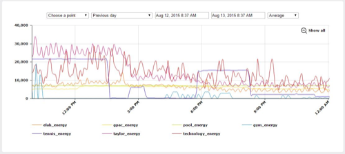
Note the graphing utility under the page which you might have to scroll down to see on smaller screens.

- Hovering your mouse over one of the red buildings brings up a window with the current sensor values for that building.

- Left-clicking your mouse over one of the red buildings will automatically load that building's energy consumption data into the graphing utility at the bottom of the page.
- this can be done multiple times in order to compare, contrast, and correlate between data points.
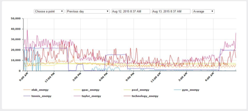
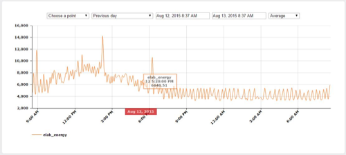
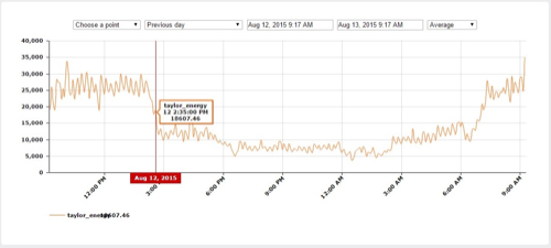
- Hovering your mouse over the graph displays the data point name, timestamp, and value.
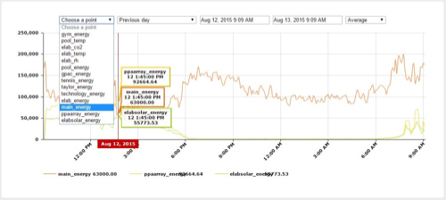
- Data points can also be selected through the top-left input of the graphing utility.
- Points of interest are
"main_energy"=total campus consumption measured at Helco meter,
"pparray_solar_energy"=array of solar panels behind E-Lab,
elabsolar_energy="solar panels on top of E-Lab,
 The input also allows you to graph atmospheric data, such as temperature, CO2 levels, and relative humidity.
- Clicking on the data point name under the graphing utility toggles whether or not it is displayed on the graph.

- Clicking and dragging the mouse along the graph highlights the region in red and then zooms in.
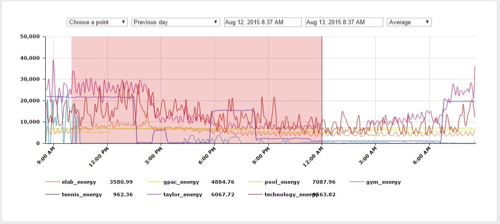
- You can also change the timerange of the graph using preset values or the custom range selector at the top of the graphing utility.
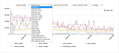

- You can also select how you want to display the data.
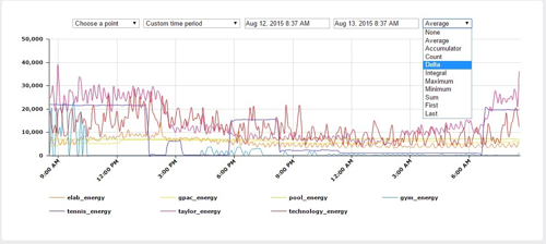
- This allows you to do complex interpretations like cost with the integral option and a factor or value stability with the delta option.
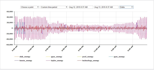
- Using this interface, you can see trends over time, and specific energy signatures, such as the power cycling caused by the refrigerators.
Comments