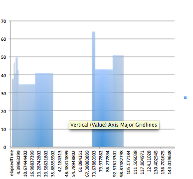
Today, in class I continued experimenting with presentation skills, and I especially looked at the bar graphs. This one is slightly harder to see the value at each time interval since the bar at each time slightly overlaps with the bar at near times. Therefore, I found this presentation method to be slightly inconvenient when projecting an accurate set of data. However, as a whole, if one is looking at the overall data it is easy to see when the person blinked the most, and the interval in which blinking was not so frequent. Perhaps in such situations as powerpoint presentations where the overall view is important, this presentation method could be useful.

Comments