Project Final Summary


My project centers around the analysis of electrical consumption, specifically involving the HPA Campus energy audit. I use the ELAB's advanced telemetry system, which turns data from remote sensors into graphs. I analyze those graphs by first identifying energy fingerprints by size, shape, context, and pattern. By analyzing and identifying energy fingerprints, and they are uniquely expressed on a graph, I am able to determine better and more specficially how electricity is being consumed. From there, I analyze larger patterns and go on to make calculations to outline the current consumption. Then I make more calculations and recommendations on how the energy could be conserved or used more efficiently.
Over the past two years, I have collected, calculated, and analyzed much for the HPA Campus Energy Audit, which has been my primary focus. Overall, I've left a large base of work that can be acted on or further analyzed to improve energy consumption on campus. My goal was to help the school achieve energy efficiency, and while it hasn't happened yet, I think my work has helped progress this improvement. Initially, I wanted to complete the audit myself, but it is a large undertaking and I will be leaving it to a very capable rising senior, Alice Patig. I will be leaving my work to her to build on and make her own. I have taught her what I can in person, and I will be leaving the rest for her on my weblog, which she can always reference.
0 comments

Final Summary Video

0 comments

Blurb


I analyze the consumption of electricity and other resources based on graphs. I then make calculations and recommendations to improve the efficiency of that consumption. My work can be used to conserve and reduce the consumption of fossil fuels and other resources, and therefore aid the fight against global warming and other environmental issues. By saving electricity, the school and community can save money, and use those funds for other beneficial programs. As I took over this project from my predecessor, Kat Bradley, I will pass it on to Alice Patig who will continue to build on my work.

0 comments

Week 30 Summary

I spent this week studying for my AP Art History and AP US History exams. Because of this I didn't spend time working on my project. I also missed class because of the tests. Next week I will be working on the independent rubric and presentation. I will also be meeting with Alice to discuss her taking over my project next year.

0 comments

Week 29 Summary

This week I viewed and analyzed the cafeteria consumption. I look at both the TED and telemetry data. Next week I'll be looking further at the gym consumption, and trying to figure out context details about the cafeteria so that I can verify my hypothesis.

0 comments

Cafeteria Consumption (kWh & $)


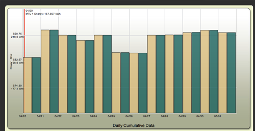
This graph displays both the kWh and the cost ($) of the recent cafeteria consumption. The 20th is a monday, yet is much lower than all the other days. This does not fit with the pattern of low consumption on the weekends as seen on the 26th and the 27th which are a Saturday and Sunday. The 21st a Tuesday is also noticeable higher than the rest of that week. These differences could be attributed to a change in menu of small changes of turning things off or forgetting to. However the consumption of the 20th could be attributed to the power down of a large refrigerator or a few. This may be for the sake of cleaning.


0 comments

Week 28 Summary

This week I focused on the new cafeteria sensors. I met with Dr. Bill about them and we discussed the consumption and how it could be minimized. I took my time to look over the new data and began analyzing the night consumption specifically. The night consumption is important because it is harder to target and cover with renewable energy due to the campus's reliance on solar energy. Next week I will continue to look at the new data from the cafeteria, but also analyze the new gym data.

0 comments

Cafeteria Night Consumption


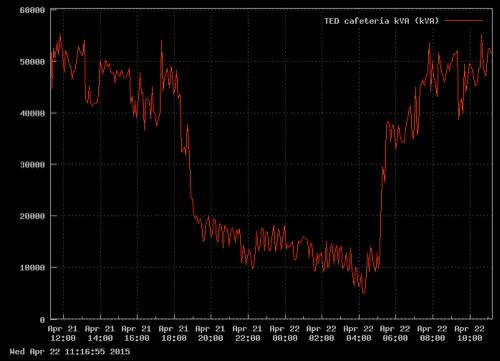
The consumption of the cafeteria from approx 7 pm to 5 am indicates the activity of multiple industrial refrigerators. There are probably three of them as the cyclical nature of the consumption indicates. The consistent cycle of spikes in consumption with breaks in between correlate with the defrosting of the fridges at night. The fridges heat up to minimize frost and ice but then cool down again to maintain temperature. In between each process the there is decrease in consumption. During the decrease in the consumption of one frige the graph allows us to see the cycle of another fridge that requires less energy and is therefore normally hidden below the most demanding frige. A second fridge is visible at around 9 pm, and then a third at 3:30 am.

0 comments

Cafeteria Consumption

Recently, sensors have been set up in the cafeteria. The consumption is quite high and has a 4:1 power factor. The sensor measures the kVa in order to display a more accurate reading of the consumption. I have been looking over the cafeteria consumption thus far and have noticed several patterns. I've been discussing the consumption with Dr. Bill.

0 comments

IT Check-up


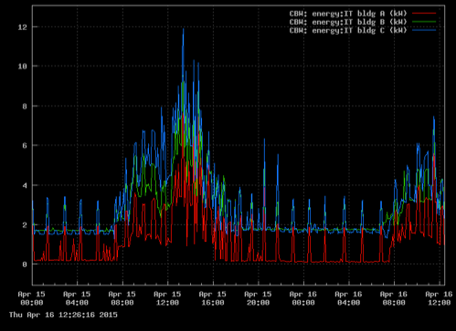
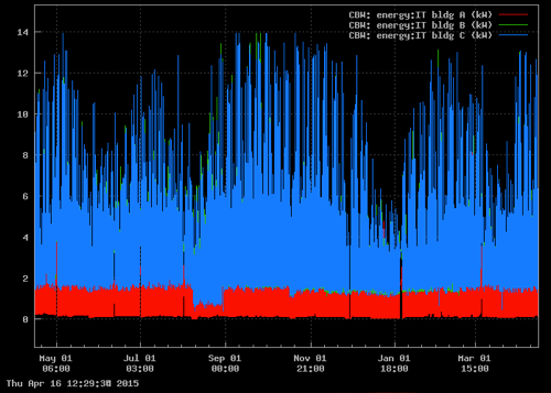
I haven't looked at the IT consumption for a while and I was curious if any changes had been made regarding the AC usage. The inconsistent consumption takes place between 8 am and 5 pm during the typical school and work day. The dormant consumption is clearly computers charging as the consistent and evenly spaced incremental spikes of consumption indicate. The graph below displays the past 12 months of data.


There have been no serious changes in consumption. The peak remains between 12-14 kWs. The short periods of decreases in the blue are indicative of weekends, while the large periods of time with decreased consumption correlate with various breaks.

1 comment

PPA Vs. HELCO

PPA
HELCO


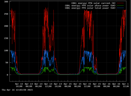
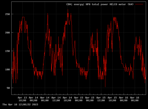
The electricity supplied by HELCO peaks when towards the beginning and end of the day when there isn't much sunlight, but still human activity that requires consumption. HELCO power is at its lowest in the middle of the day when the PPA system is generating the most energy. Although the necessary HELCO never reaches zero it averages around 80 kWs. This means the PPA is supplying the majority of the energy needed. The PPA and HELCO graphs reflect each other, as electricity is provided to the campus. On average, every time the PPA is at it's peak of 250 kWs for one hour HPA saves $67.50.

0 comments

Week 27 Summary

This week I took a look at the new TED gym data. The system is still working out some kinks, but the data provided is already proving valuable. I plan to continue watching and analyzing the patterns of consumption to determine the possibilities of improvement in efforts of efficiency through conservation and a renewable energy supply.

0 comments

Gym Consumption Patterns


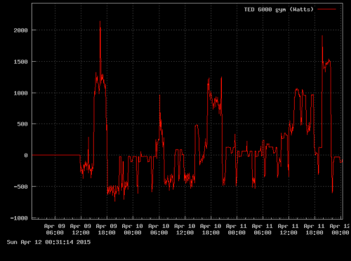
Although the negative consumption is present, the rest of the positive consumption appears to correlate with normal gym activity. The largest consumption appears during sports time (2-6 pm). On April 10th this afternoon consumption went until after 8 pm because of the boys volleyball game. The consumption that is recorded at 0 Watts appears to be accurate in form as it correlates with the minimal lighting that would be found in the offices and trainer rooms. The loads displayed in the larger peaks indicate much more than lighting, although that is also a source of consumption. There are consistent lighting loads, and less consistent ones as switches go on and off. Sound systems are in use, along with the large screen TV in the trainer room. Within the context of the building, I know these are possible options for consumption, but there presence becomes clear on the graph due to their energy fingerprints.

0 comments

Gym TED Data


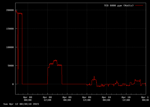
The gym is not equipped with a TED unit. I believe that there has been a change in calibration of a system problem as the consumption went from 20,000 Watts to roughly 2,000 Watts. The later data also displays negative consumption, which would makes sense if the gym were drawing from the Solar PPA, but I don't believe that is happening, especially since there are no batteries or storage options available yet for negative night consumption. The earlier readings are much more isolated and consistent in shape. This energy fingerprint indicates lighting mostly. There are also large gaps in consumption where the system stopped recording. The latter data is most likely post recalibration and more accurately represents the varying consumption of the gym.

0 comments

Week 26 Summary

This week I met with Dr. Bill several times to discuss the new TED Pro systems. I spent time familiarizing myself with the TED Pro page for the PPA Solar system. Next week, hopefully the new TED units will be installed, so that I can begin to analyze the Cafeteria consumption

0 comments

kWhs & Dollars Saved


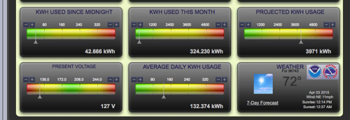
This dashboard is a part of the new TED Pro system for the Purchase Power Agreement Solar system

The TED Pro system also tracks the electricity provided (kWh). April has just begun and already the system has saved $324.00. Although the system says that is how much has been used thus far, it is really how much has been produced from the PPA system. The system also projects the monthly savings. The projection may be inaccurate because the future weather in unsure.


The dollars saved this month are also presented with projections. Overtime this will provide clear data for the school to prove it's economic value and the ROI.

0 comments

PPA Solar

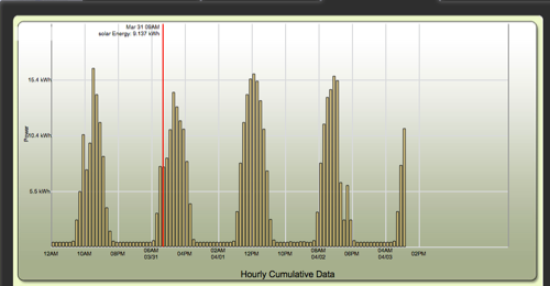
After looking at the TED Pro site designated to the PPM solar system, I also looked at their daily graphing. It based on the sunlight converted to energy, so when there is less sunlight the graph displays that. On the first pyramid of data from 3/30 spikes of nearly 13 kWhs, which is roughly double the previous reading. This spike is followed by a large decrease to approx 9 kWhs, but the graph quickly recovers after and continues to climb. This decrease is due to the cloud cover. On 4/2 the same event was displayed at 3-4 pm. This lapse in energy is due to the changing weather. It will be interesting to see the patterns of data through the different seasons. Over the period of years the comparison of energy would be insightful to the changing weather. It could also reveal the effects of global warming and vog along with economically benefiting the school.

0 comments

Quarter 3 Video

0 comments

Week 25 Summary

This week I focused on the TED cottages. There was an abnormality in consumption due to a sensor error. I also compared the data between cottages and found large loads that are consistent for long periods of time. They are characteristic of tvs, dehumidifiers, and lighting. I also took several tests for the brain team and worked on my quarter video.

0 comments

Finishing Up The Quarter

I spent Friday going through my past activity on my blog and planning my quarter video. I also took several test on expanded colored word selection for the brain team.

0 comments